Monday, October 31, 2011

Portfolio: Autumn

Whilst I have easily chosen the site for my 4 seasonal photographs and am slowly collecting images week by week, the other element of the portfolio is giving me a real challenge.  I selected the site for Assignment 1 carefully and it has turned out well, yielding a cohesive set of photographs that carried the narrative I set out to deliver.  However, subsequently I must now return to the site and generate 3 photographs for each of the following seasons, Autumn, Winter, and Spring.  This is where I have come a little unstuck.  I am finding it difficult to drive variety and coherence in the Autumn set of photographs.  First of all the urban elements of assignment 1, the two villages, will not easily work with a seasonal theme as concrete does not greatly change with season.  OK, there is some vegetation, but this is peripheral to the photographs.  This leaves me with the hill and Olympic site to work with.  Good material, in one sense, but hard to craft further than I have already taken it.

Given a free run at this, I think I would be doing something quite different for the portfolio element of this course.  I think of a portfolio as a personal statement of my ambition as a photographer, seasonal photographs of a semi-wooded landscape is not quite what I am about.  I would prefer to deliver an urban portfolio divorced from the seasons, reflecting my relationship with my city.  However, as I have admitted before, this is an educational experience and perhaps I do need to learn about how to capture the seasons as they pass.

The problem is that I am not really into golden trees in a rolling landscape, so I need to deliver something else.  It is also true that a hill is a hill, trees are trees, I need to express what is unique about this hill and these trees!  In effect I must capture the fact that this is the Olympic site in Munich and a place much enjoyed by the local population.  With that in mind I have spent the last 3 weekends walking once more across the hill trying to capture its essence, but also within an autumnal theme.  Autumn brings to mind a number of thematic elements, golden trees, early morning mist, long shadows, people wearing a lot more clothing, and finally the fallen leaves.  For my photographs to correctly say "Autumn" I will need to contain at least one element per photograph.  I have selected quite a few photographs from my recent shoots and grouped them into ideas that might generate a photograph for the portfolio.

Once again, I am posting a large number of photographs, but this is the way I want my work to speak. My first group looks at people in the Olympiagelande enjoying the space:


In each of the above photos the architecture of the space is very firmly imaged within the photographs, however, there are plenty of views that completely eliminate the concrete and show that this is also somewhere where city dwellers can get away from urbanization.


I am particularly fond of the second images, the colours a re powerful, blue and green punctured by the red coat of a little boy running down the hill.  Another concept I have explored is the idea of height, this is a hill after all.  How can I convey the "hilliness" of the area.  I tried to get down low and shoot up onto an artificial horizon:


Each of these more or less eliminates the hill in favor of the sky, an alternate viewpoint is to include a much greater proportion of either the hill or the landscape behind:


In each of these shots I have progressively turned the camera into the sun to silhouette the people in the frame.  Not sure about the last shot, perhaps too romantic and also not really seated in Munich or Autumn for that matter.  Stepping away from a primary focus on the people in the landscape I also have an interest in details within the landscape, the cables and pillars of the site:


The above shot is a tricky one, it is the memorial to the athletes murdered at the games in 1972, difficult to frame well and perhaps not terribly interesting, but of great importance in the story of the location.

In my submission for assignment 1 I deliberately avoided using the most prominent element of the landscape, the Olympic tower. This was partly driven by the desire to avoid a landscape format, driven by such a tall narrow object, but also because I simply could not make it work in the context of the submission.  However, with my portfolio I can look in more detail at the Landscape versus the story and so the tower becomes a key element of what I must deliver.


I all of these I think the reflected images are perhaps most interesting, maybe the one in which the tower is only visible in the reflection.  Finally I close out with 3 shots that strongly feature the autumnal colours and strong architectural elements


This final shot fascinates me, I love the reflection in this massive wall of glass, question is whether the assessors will feel the same.  Perhaps this is a good statement on the balance of nature and urbanization in the modern city of Munich.  I appreciate that the goal of this exercise is to deliver 3 shots and that I have presented 27.  This points to my lack of decision making and challenge that I continually have in selection.

I think there are sufficient photographs in this post from which to pull for my portfolio, but I may make one more visit, early in the morning.  If I judge it right and mist is rising from the lake, lit by the rising sun, I may just capture something quite special.  If I do so, see the upcoming post.

Sunday, October 30, 2011

Assignment 2: Stadt Museum

Having decided not to take any more photographs for this set, an opportunity arose which I could not drop.  A friend wanted to visit Munich's Stadt Museum, dedicated to the history of Munich. I had thought about this a few times, the museum offers two key opportunities to add material to this assignment.  The first is simply that the galleries are on the 1st and second floors directly overlooking the Platz and so providing a new vantage point from which to image the area.  The second is more difficult to work, that is that the museum contains a small gallery dedicated to the darkness of Munich's history, the rise and ultimate destruction of the Nazi party.

When I started this project, I had thought to try to directly connect to imagery of the 3rd Reich, but after time the uplifting nature of the new buildings and people made this more difficult to face let alone integrate into the story.  This museum is not an easy place to be in, the images are disturbing, the legacy it speaks to is of deep horror.  Strangely on visiting the museum it is not the posters, uniforms or official documents that horrify the most, it is seeing the ordinary transformed.  A colour picture of Munich's town hall bedecked in red and black flags, a tablecloth embroidered in swastikas, but most disturbing children's toy soldiers parading in Nazi regalia.  This is difficult at so may different levels.

Before moving onto the Nazi imagery, I started by taking some shots of the Platz from the museum.  The first one is through ground floor barred windows, perhaps symbolic of the remaining distrust in Munich of Jews - it still exists, the Platz is well policed, Neo-Nazis would see this as a place to attack.


Going up one floor I get a good view down into the Platz and one which I find very satisfying, combining a strong geometry, but also picturing people enjoying the square - might be a keeper.


Alternatively this photograph has a tighter crop and a little more movement from the people in the foreground.  It diminishes the formal structure of the space, but adds more humanity.


Going up another floor the view changes once more.  I have lost some of the structure of the first images, but can now combine the older historical buildings that remain in the Platz.  I am less sure of this image, it is more descriptive, but less attractive as a photograph.


Moving into the Nazi Museum, the space is very tight and the lighting is extremely low.  Flash photography is forbidden, not that I would want to use it for such shots, but this means exposure on the edge, this is f/4 at 1/25s and ISO 3200.  With this photograph I have tried to combine the Nazi image of the grasping jew, with the uniform of the party soldiers.  These are not movie props, they are the real thing, used to generate hate and ultimately genocide.  I have processed both in colour and B&W at this stage, both work, however, I find the B&W version more satisfying.


The question is not one of photographic quality or composition, but of narrative and context.  Do I want to start or finish my narrative with a reminder of what once was.  I think so, but am still not sure.  My other photographs are light and strong, this is dark and evil.  Again, the questions this project are asking are not the traditional issues of photography, composition, colour, framing, they are all about how  I want someone to see the photographs as a set and what I want them to take away from the experience.  I also love my city, and whilst fascinated with its' history, do not want to make everything I do here in the frame of the Nazis.

I finished my visit by taking a few more exterior shots that took advantage of the strong low Autumn light:


I still find this graphic quite funny, the Germans add ham to almost everything, tough place for someone with a very particular diet to exist.  I also found the child's bicycle quite funny, many of my shots here have a bicycle chained to a tree in them, this one is simply a little smaller.


I also took another look inside the Jewish museum to see what I could do.  The problem comes down to the strong contrast between the inner darkness and outside world.  This will probably work better in mono.


I am definitely heading in the direction of a monochrome treatment to this set, although I have interesting colour the strong structure and in many cases limited colour range is suggesting B&W.  I also consider that completing one of the these assignments in B&W will help me to develop a broader understanding of the art of photography.

Assignment 1: Tutor Feedback

My tutors feedback was both positive and informative, providing background and additional context to the assignment I had just completed.  In particular he related the architectural style of many of the buildings I had imaged back to the Bauhaus movement of the Wiemar republic, a movement repressed in the 30's, but reinvigorated in post war Germany.  I notice, as I walk around Munich, that the clean, functional design pioneered 90 years ago is still very visible in newly build apartments.  Indeed in a country dominated by apartments versus houses design has a much greater play in building.

Moving onto the specific feedback, I was on the whole very encouraged by the feedback, it seems that I am making progress and developing a degree of my own style - perhaps not a voice, as of yet, but a beginning. Two photographs needed amending, one by re-framing the other by replacement.

Roofs (Legacy-6):


This image was seen as weak, the support to the right leading the eye out of the frame.  I tried reworking it to a better crop, however, I could not make it work.  At this point I had the opportunity to add another photograph that had been rejected as it was in portrait form and I had decided to go with identical framing for all but 1 shot:


However, it was strongly suggested that I consider a very tight crop to bring the focus of attention into the architecture rather than the sky:


This is now the image that I will submit for assessment, it has the same narrative as the former image, but is better structured and also capture two extra elements that tell more of the story of the park, firstly the rather odd car shaped peddle boats that people can hire in the summer and a mounted policeman.

The other photograph needing work was Primary (Legacy-9).  In this case all that was needed was a more intelligent crop to a square form, better defining the strange structures of the student village.


In moving onto the next few assignments I feel that I now have a choice to make, whether to continue with a very bold composition reinforced with strong colour, or to start exploring other forms of photographic expression.  Whilst I am aware of needing to development personal style, I do not think that now is the time to do that.  These Level 5 courses offer me a chance to explore ideas and styles, before having to commit to greater consistency in the Level 6 courses that bring me towards the final grading.  I am already working on both assignments 2 and 3, each of which has the potential to be very different to this submission.  Assignment 2 is in the city, a study of a small area, and currently targeted for a B&W treatment, retaining strong geometric composition, but abandoning colour.  With my early thoughts towards Assignment 3, I am working in the early morning mist looking at how the light interacts with space in a local park.  This requires delicate colour management and results in very soft forms that have little geometry.  Whether this becomes Assignment 3 or not, will depend upon feedback from my tutor, however, I feel the need to explore a more lyrical compositional style.

Learning Points:
  1. In this submission my goal was to generate a uniformity in the size and aspect ratio of the printed photographs, very much determined by the A4/A3 destination of the final output.  It was clear that this is not necessary and that experiment with aspect ratios is part of my development.  However, I find that this will work for certain subjects, others need the uniformity of shape to drive the message of the photographs; I will explore this in future assignments.
  2. A key comment made several times was that there was an absence of people in my shots.  I take that point, especially in photographs that look at inner city spaces and how people inhabit them.  Again this is not always going to be appropriate.
  3. I need to be more careful about the placement of the edge of the frame and how it interacts with the subject matter.  I am also a little careless about composition, I need to very clearly work on tightening up my composition, these are supposed to be interesting photographs, not photographs of interesting things.

Saturday, October 22, 2011

Assignment 2: Colour Set

Although there are a number of decisions that need to be made prior to submitting the assignment, a key one will be whether to go ahead with a colour or B&W set, mixing the two is not an options.   When I started I was pretty sure that this would work better in B&W, the rather somber sub-plot and the highly structural nature of the space all suggested a monochrome treatment.  However, we have just enjoyed one of the best late Summer, early Autumn periods that I can recall, resulting in far more colour in the photographs than I had anticipated.  Subsequently I am first assembling a set of images that would work as a colour set.  B&W versus Colour is not simply a matter of processing it is also a matter of selection, some images will work as colour or B&W, but not both.

The other consideration is the colour palette that I am working with.  One reason I had B&W as the intended goal was that the Platz is largely monochrome, a mixture of stone, concrete and glass, with limited other colour.  With the good weather, a vibrant blue sky illuminated this dull world and mixed with the terracotta of the roofing tiles in the older buildings suddenly yielded a balanced colour scheme.  Although there is some greenery in the space, it is limited and the photographs that work seem not to contain too much.

Having determined to build a set with colour as the rendering intent, the question of how to theme the set becomes point.  I have struggled to get to this point, often documenting the fact that I am experiencing a lot of frustration with this assignment.  This stems from the fact that rather than creating a narrative sequence of photographs, I am documenting a small space occupied by some very large buildings.  Sure there is a tale of rebirth and survival, however this is a constant buzz, not a developing narrative.  These photographs have to illustrate elements of a whole, singly they might mean nothing, only together will they tell my story.

This set of photographs has to achieve a number of goals:

  1. Show that Judaism is alive once again in Munich
  2. Illustrate that the space is part of the broader culture of the city
  3. Place the new buildings within the old city of Munich
  4. Demonstrate the architectural nature of the space
  5. Leave a sense that all is not completely well
  6. Do all of this with a series of technically good photographs that have visual quality irrespective of the subject
Added to these concerns I also add the need to populate the photographs, this is a used space.  Not all of the photographs feature people but most do.  Finally I make no pretensions towards getting it right in the camera, I have utilized a variety of crops and have used Lightroom the the best of my abilities to improve the visual quality of the images.

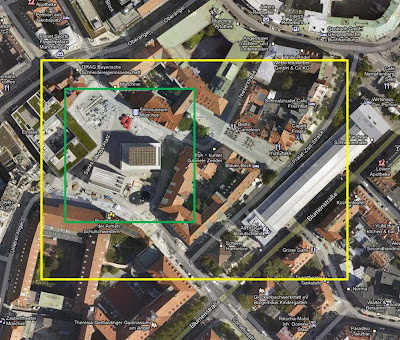
Finally, before the photographs themselves a comment on the space occupied by the Synagogue.  In my first post on this assignment I displayed the following image, a Google maps screen grab showing the Platz and the buildings within:


The green line is the boundary of a single acre of space, the yellow line a rather larger area that I was going to allow myself.  As it turned out every photograph in this post and under consideration for the final set was taken within the green line, the acre ceased to be a limit and became a linking boundary. 

To start the set I begin with a shot of the old Munich arsenal, now the cities museum.  This houses a substantial Nazi exhibit, I have chosen not to include this in my set, it adds nothing that we do not already know about Munich.  The bicycle against the lamppost is a recurring theme in this set, people need somewhere to chain their bikes when they go shopping:


I like the eye on the building watching me, it is in the next photo also.  The next photo starts to juxtapose the newer buildings of the Jewish center with the older buildings of Munich.  To the right is the Museum book shop, to the left the Jewish Center, containing a cultural mission and a kosher restaurant.  Again I have included someone moving through the Platz to add movement and scale.


Walking 20 meters forwards and turning around the wall of the synagogue comes into view on the left, with the gaunt edifice of the cultural center behind.  This is not an attractive building and is heavily protected, bullet/blast proof glass occupies the windows.  Again a group of people adds movement and scale to the shot


There is a good deal of glass in the museum and given the right time of day it acts as an effective mirror.  This is a busy photograph, containing several ideas.  First of all is the reflection of the traditional Munich architecture in the glass, the old and the new.  I tried to directly image the pink building but could not find a satisfactory way to do it with interest.  To the right a lady runs her hands over the rough wall of the synagogue, most people are drawn to do this at some time, such is the texture of the stone, reminiscent of the wailing wall.  Finally a lady with a buggy is reading the text on the wall of the museum, which tells in German and English a number of little stories about what it is to be Jewish in modern Germany.  These stories are funny, but also very serious.


This is simply a descriptive shot showing the synagogue and the children's playground to its front.  I need to add some scale and perspective to the Platz.


Getting a little closer I am very fond of this capture, it conveys much of what the Platz is about, the gaunt synagogue is adjacent to a nice little playground, kids are always here playing.  There is life in this space, this is not a place of mourning, which it could easily be, 4,000 Munich Jews did not survive the war.


Now in a descriptive social documentary mode, I have turned the camera ninety degrees and imaged the cafe at the front of the museum, a place for parents to take a break, a beer or coffee and let the kids play in a safe car free environment.  This one may not survive transition to B&W, colour is the basis of the shot


Next I turn to a few details in the Platz, these are the armored windows of the Jewish center, reflecting the Munich museums older architectural style.  Not 100% sure about this, but it shows the old within the new in a kind of diptych.


A further juxtaposition is the roof of the synagogue with the Alter Peter in the background, two religions co-existing in a harmony of blue sky.  The lattice work seems to me to be a part of the Star of David and is meant to symbolize the tents that the ancient Israelis would have lived in.


Sadly it is not permitted to photograph inside the Jewish Museum, but one can use a camera in the lobby, so a chance for an inside out shot.  Once again the bicycle


Whilst pulling these images together I have tried to mix up the time and weather, once returning at dusk with tripod and 17mm tilt shift.  This is the first time in the set that I have shot the entrance to the synagogue.  I also wanted to show the inside of the museum, the dusk light makes this possible, whilst the two guys in front once again add some scale to the picture.


My final shot is a reminder that all is not completely well, the red bollards in the foreground and background exist to stop any vehicle getting close to the synagogue, car bombs are considered a serious threat to the buildings.  Although Judaism has been reborn in Munich, it is still under threat wherever it exists.


Well, that is my first go at creating a coherent set of photographs for submission as assignment 2.  I will think about the photos some more, there are a few weak links, the interior shot is hard to understand, however, I see no need to do any more shooting at this stage.  Next I will take another look from the perspective of what will work as Black and White.