Showing posts with label Portfolio. Show all posts

Saturday, June 30, 2012

Portfolio: Finalizing and Printing

After some insightful feedback from my tutor I have decided to swap out the spring set for a new one, abandoning the pink trees in favour of a slightly more muted evocation of the season at the Olympiagelande.  I now have my final portfolio and spent the afternoon today printing them for assessment.

The portfolio has been a laborious, but valuable piece of work, I have spent many weekends in all sorts of weather, from minus 15 to plus 30, exploring the shape and form of the landscape of the Olympic Park.  I treated it as a natural follow on from Assignment 1, but limited the scope to a much smaller section of the landscape.  With the exception of 1 photograph out of the 12, all are taken in and around the stadiums and in particular the hill. This enabled me to paint a broader picture of this man made topogography, revealing more of its form but also its use.   

With spring I have tried to capture that time when the trees are just budding, when blossom still  hangs in the trees, and people start to emerge to enjoy the finer weather.  Summer in the park brings a series of weekend events ranging from the Waterski competition I have captured to motor racing in the main stadium.  Autumn brought the colour change and with it a fall in temperature reflected in the heavier clothing worn by the diners in the third shot.  Finally mid-winter saw temperatures drop to minus 15 and the landscape carpeted in frost and snow.  The first winter image also brought an opportunity to show the proximity of the hill to the city.

In the other park, the Englischer Garten, location for my 4 identical shots of the seasons, I still struggle with the summer image, the fierce sun makes for a rather washed out look, however, that really is what summer looks like here.  Without the sun there would be no people and no photo.

Here is the portfolio in completion, with the 3 new spring images


My final act in working on my portfolio is to print it.  It is only until I print an image that I can genuinely say I have a photograph and one that works.  Printing is a minefield, however, one I can now navigate with confidence.  Calibration of my monitor and the correct printing profiles have enabled me to pretty much guarantee that what I see on the screen ends up on the paper.  Given that I can manage the colour the remaining question is what paper.  I am printing everything for Landscape to A3 format as I want to ensure that the images carry the weight that I want.  For Social Documentary I may opt for A4 as that may be more appropriate for the subject, however, right now I want big, but not huge prints.  During the course I have used two different papers, Ilford Gallerie Smooth Pearl and Epson Matte - Heavyweight.  For Assignment 1 I wanted a semi gloss finish that would capture the detail of the Olympic landscape, as a result I have used the same for the portfolio for consistency.  For Assignment 2 and 3 I used the Matte paper.  The Matte paper handles the dense blacks I wanted for the B&W imagery of assignment 2, but also provided a soft finish for the muted early morning images in assignment 3.


I hope the assessors appreciate that I am trying to use the paper most appropriate to the subject matter, even thought that means changing the medium during the course.

The final question in the printing process is how to manage the placement of the photograph on the sheet.  I no longer crop images to fit the paper, I accept that my photo might not have even margins.  I also do not crop the paper physically to fit the image, this would make assessment painful as each sheet of paper might be a different size.

My strategy is to export the image from Lightroom as a 16bit Tiff (100MB file) and then create a "printable" image in Photoshop.  What I mean by printable is that I make a few late adjustments to levels and then add a white border around the photo with exactly the mm dimensions of an A3 sheet of paper, namely 410 x 297 mm.  I want a 2cm margin around the photo for handling (4cm has been suggested, but I think this too big).  First I change the image size so that the photo is 38cm wide on the longest dimension.  I then add a 2cm white border around the photo using the canvas size tool.  The final processing stage for a 3:2 aspect ratio image is to add a further 4 mm margin to the bottom of the image.  This shifts the photo up a little placing the images center of gravity slightly higher on the page, a visual trick to add weight to the image that is strongly suggested by several OCA tutors.  With the 2:1 ratio images this is slightly more difficult, I add 2cm either side and then 4cm at the top of the image.  This means that there is a 6.7cm margin on the bottom, perhaps too much, although I like the result so am sticking with it for the time being:


Not the easiest or cheapest way to present my work, but I am very happy with the results, the Epson R3000 is a very good printer and I think capable of producing gallery quality work, although my printing skills are probably no where near that level yet.  I need to do some more. research about ink jet fine art printing before I move to stage 3

Tuesday, April 24, 2012

Portfolio: 2nd 16

After some more photography, much thought and not a small amount of angst, I have now selected a second set of images.  With the exception of the Olympiagelande Winter set, each set has a single change:

Same Location: 4 Seasons


Spring

Summer
 

Autumn
 

Winter

I still have some doubts about Spring, the first of the photographs, I think another week will bring better development of the foliage.  However, that is then that, as I will not get another chance to shoot Spring until 2013.

Olympiagelande: Spring

1

 2

3

I have fully embraced the theme of the spring blossom, but tried to select 3 distinctive photographs. Any other images either echo Winter (bare trees) or Summer (bright skies and t-shirts).

Olympiagelande: Summer


4

5

6

Here I have dropped a weak photo and homed in on the theme of the water ski tournament.  The last photo replaces the architectural one from an earlier set.

Olympiagelande: Autumn

7

8

9

Sadly I have decided to drop the photo containing reflections on the lake.  The shadow on the left of the photo was too strong and although it could be weakened this left the photo looking a little artificial.

Olympiagelande: Winter

10

11

12


Very happy with this set, in fact I have so many strong winter images that I could have done the whole portfolio on winter and still have better images than for the other seasons.

This is now very close to final.  I will check with my tutor and then come back to the images on my return from vacation.  I have not printed anything yet, this might introduce some additional issues, but I don't expect that to be a problem

Sunday, April 15, 2012

Portfolio: First 16

I am beginning to close in on the final set of photographs, Spring still needs some development and the upcoming weather looks as if it will cooperate.  However, I now have what I would consider to be a set of photographs worthy of submission if no further opportunity arose.

4 Seasons - 1 Location

I have over 60 shots taken on different days for this first set of photographs from Project 15.  As yet these are almost all Winter/Autumn, corresponding to the time I was working on Assignment 3.  For Summer I have a few candidates, but no single stand out photograph. I have only one Photo for Spring and whilst it is technically OK it does not shout Spring.  For the other 12 photos I am sticking to the native 3:2 aspect ratio of the camera, for the 4 here I have chosen a 2:1 ratio that fits much better to the subject matter.


This image for Spring has a good sky and he rich colours of the buildings work well.  The problem is that the trees are not quite leafing yet and so one comment made was that this looks more like Autumn.  Possibly, but Spring and Autumn do have a certain amount in common, lighting for example is quite similar


For Summer, I have been fighting with this photo for a long time.  This was taken in mid-afternoon.  All of my other photos were taken in early morning with the Sun behind me.  I could do the same for Summer and may yet if I cannot get this to work.  However, Summer means people in the park enjoying the park.  I am willing to trade some image quality for some narrative content.


For Autumn, the question was leaves or mist, I have chosen mist as this is more reminiscent of my experience of Autumn in the park and is a little less cliched whilst still carrying the essential message of Autumn.  I also like the overcast sky reflecting the lights of the city.


Winter is a no-brainer, this snowscape under a steel grey sky is the best image in the set.

With all of these shots I have done my best to frame them identically, it is not perfect, but I think close enough for the exercise in question.

Moving now to the extended study of the Olympiagelande, I have selected a new Photo for the Summer set and 2 new images for the Spring Set

Spring


With Spring I want to get across the rebirth of the site under the new tress and with people starting to enjoy the site once more.  So far the 3 photos capture the first element, but not the second.  This is not a major problem, but lets see whether I can further develop this.  In each of the sets there is an image that overlooks the site from different angles, the 3rd photo here adds to the overall story and I do like the geometry of the image.  The problem is that it does not convey Spring too well - the yellow tree blossom helps but is perhaps too small


Summer

Summer is all about colour and enjoyment of the site.  The 3 photos chosen are all different views of a water-skiing event that took place last July.  I have tried to maintain a similar style across the images in each set, but not between the sets


Autumn

The easiest from a message point of view, colour conveys the season.  The challenge here was to mix the colour of the season into the architecture of the park.  The second image contains two references, the tree, but also the people huddled against the cold, but enjoying the late Sun


Winter

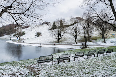
All other images here were shot with my 5D2, for Winter I have used my new Fuji X100.  The colour rendition coupled with the excellent 23mm (FF 35mm) fixed lens captured the colour of winter perfectly.  Normally renowned for producing vivid colour, the camera handled the subtle blue and green tones of the frosty ground and sky extremely well.  These photos depict the emptiness of Winter, but each still contains many people enjoying the par.  The first image also serves to place the whole set into the context of the city.


Next weekend I will rework the Spring photos, but this set is now very close to what I want to present.  Thematically it is not a tight as I would have ideally wanted, but I think it expresses quite well my own developing expression in photographs