Thursday, April 26, 2012

P39: printing a backlit landscape

Once again I have completed this project in colour and not the suggested black and white.  Reflecting upon my last project, also in colour rather than B&W, I have concluded that this is better done in colour.  Colour is far less forgiving of radical processing than B&W.  A colour photo will shout out loud that the processing is badly done, B&W on the other hand frequently benefits from extreme processing, a key advantage of B&W, but a property that makes this exercise too easy in Digital.  The human eye is too familiar with the rightness of colour. We accept B&W as an artistic interpretation of reality not a literal one.

For this exercise I have gone back to a set of images originally taken for Project 18, a study of the Autobahn and a group of office buildings behind which the sun was setting.  Here are 3 of the original photos showing the progression I was attempting to capture.


The objective was to capture the changing light in the sky and study how the foreground artificial lighting becomes more prominent in the exposures as the ambient light diminished.  The price that is paid is an almost complete loss of foreground detail, even in the earliest shot.

However, what if the goal had been to portray the road and buildings against the sky, but without loss of detail in the buildings.  Looking at the histogram for this image, we have over and under exposure in the same frame with loss of detail at both ends of the scale - the exposure is actually fine, but we have run out of dynamic range in the camera


Starting with the initial shot the first thing to do is to adjust the image to optimize the background cloud and sun:


The problem this has induced is that the buildings are now even darker.  I can adjust that by increasing the shadow levels, but at the expense of adjusting my finely tuned sky tones:


Also at this stage the buildings are still too dark, but any further processing would ruin the sky.  At this stage I painted in an adjustment mask:


This now meant that I could adjust the foreground exposure independently of the background.  I lifted the exposure by 1.5eV reduced some of the highlights, added in some shadow detail and increased the clarity slider:


I may have overdone it, the image is starting to take on something of the look of an HDR image, but is I  think still acceptable.  It is surprising how much shadow detail existed in the image and how powerful a tool Adobe Lightroom is for making these types of adjustment.  I am now getting to the point where Photoshop is simply a printing engine.

Returning to the original theme of B&W, here is the straight conversion from the final colour image


I have then pushed the boundaries much further than with the colour image, again I am hitting the edge of obvious fakery, but the B&W image is still an interesting photograph, we know it is wrong, but it is wrong in an interesting way.


So, I did not do any printing for this exercise, but that was not really the goal, the objective of this and the previous exercise is to learn how to make selective changes to the exposure of a single frame.  In the days of film this needed to be done at the printing stage, digital processing now enables that to happen at the development stage.  It is not all rosy in the Digital garden, over use of these tools makes something of a dog's dinner, however, subtly done they can transform a photograph.

Often times people talk about rescuing an image with these techniques, sure that can be useful.  However, I would contend that the real value of the these techniques comes from enabling us to make images in far more marginal exposure conditions than would have formerly been the case, secure in the knowledge that a second exposure process can be applied.  This is not an excuse for sloppy exposure management in the camera but a real creative option that extends the capabilities of photography.

Wednesday, April 25, 2012

P38: burning in the sky

Well, once again I am going against the grain.  I can see the value in working in B&W, but having already delivered Assignment 2 in that medium I can't quite see the value in developing those skills now, especially as my final assignment will be distinctly colourful.  However, taking away the basic premise of burning in a print and reworking this project in the context of  Digital, this exercise becomes a useful skill development.  I recently upgraded my primary Digital workflow tool, Adobe Lightroom to version 4.  With this upgrade came a major change in the processing engine and in particular an improvement in the toolset for selective development.  I have thus used this exercise to explore the capabilities of these new tools and practice a little.

For the exercise I have selected one of the shots taken for my portfolio, but as yet rejected:


This image is very typical of a RAW file just after import into Lightroom, it is rather flat and dull.  The fact that I was shooting into a bright sky means that the foreground is a little darker than I want it to be.  However, the Histogram for the shot is pretty well distributed with no loss of detail.  This is a photo that with work should be capable of brushing up nicely.


My first job is to adjust the exposure and shadows to brighten the foreground, whilst trying to keep the sky under control using the Highlights and Whites sliders.  I have also added in some Contrast, Clarity, and Vibrance to add some "pop" to the image.


At this point I have an acceptable photograph with a rather nice softly pastel sky, however, what if I want to darken that sky and make the photo more dramatic.  Here is where the new tools in Lightroom 4 come into play.  I can now use the adjustment brush to paint in a mask and then effectively process the masked area separately to the rest of the photo.  Painting the mask is a fiddly job, but with the ability to add and subtract, plus a useful "Auto Mask" function this is not too onerous.  I guess I spent about 15-20 minutes on this one. Using this tool does have a pretty major effect on my computer, it very noticeably chews up processing power - my machine is 2 years old, has a Quad core i7 CPU and 8GB of RAM, so no slowcoach.


With the mask applied I then adjusted the exposure, but no other tools:

-0.5eV

-1.0eV


-1.5eV

-2.0eV

The effect is pretty strong beyond -1eV and halo'ing around the buildings is becoming an issue, although another go over with a vert delicate brush might fix that. At -1eV I think I have a good balance of colour in the sky with the foreground, beyond that (ignoring the halo'ing) the effect becomes rather surreal.  For some applications this might work, but not for this one.

BUT, this is a lot of work for a fairly simple adjustment, one that can be done pretty easily with the application of a grad filter to the image.  In the following I have placed a grad filter over the top 2/3 of the image and applied -1eV.


Frankly, I find this more convincing, the gradual application of the filter from -1eV at the top of the photo to 0 just below the tree line provides a more convincingly real image, completely avoiding any issue with halos. It also took roughly a minute to apply versus 30 for the burn tool.  I can see places where the burn tool is going to be useful, when a tall building penetrates a sky and you cannot really use a grad tool.  However, for most landscape photography the grad tool is easier and produces better results.

Tuesday, April 24, 2012

Portfolio: 2nd 16

After some more photography, much thought and not a small amount of angst, I have now selected a second set of images.  With the exception of the Olympiagelande Winter set, each set has a single change:

Same Location: 4 Seasons


Spring

Summer
 

Autumn
 

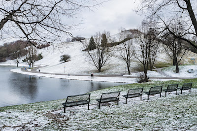
Winter

I still have some doubts about Spring, the first of the photographs, I think another week will bring better development of the foliage.  However, that is then that, as I will not get another chance to shoot Spring until 2013.

Olympiagelande: Spring

1

 2

3

I have fully embraced the theme of the spring blossom, but tried to select 3 distinctive photographs. Any other images either echo Winter (bare trees) or Summer (bright skies and t-shirts).

Olympiagelande: Summer


4

5

6

Here I have dropped a weak photo and homed in on the theme of the water ski tournament.  The last photo replaces the architectural one from an earlier set.

Olympiagelande: Autumn

7

8

9

Sadly I have decided to drop the photo containing reflections on the lake.  The shadow on the left of the photo was too strong and although it could be weakened this left the photo looking a little artificial.

Olympiagelande: Winter

10

11

12


Very happy with this set, in fact I have so many strong winter images that I could have done the whole portfolio on winter and still have better images than for the other seasons.

This is now very close to final.  I will check with my tutor and then come back to the images on my return from vacation.  I have not printed anything yet, this might introduce some additional issues, but I don't expect that to be a problem

Monday, April 16, 2012

Reading: The Shock of the New by Robert Hughes

I recently blogged on the influence of modern artistic thinking on the development of photography and my own desire to better understand Art beyond the boundaries of photography.  I do not find this easy, I struggle with the conceptual thinking behind art, however, I feel this is important and I will continue the struggle to better understand this topic.  Other than continuing to use my annual pass to the art museums I am also engaged in some reading. A year ago I read E.H. Gombrich's "The Story of Art", which provided an excellent basis in the progression of art from it's earliest origins to the present day, however, such a book can clearly only deal briefly with the rise of Modern Art.  Subsequently I purchased "The Shock of the New" by Robert Hughes.

The Shock of the New: Art and the Century of Change

This rapidly became shelf-ware, it was only with my investigations of the motivations behind Andreas Gursky's work that I realized it was time to learn a little more.  This book provides a good introduction to the subject of 20th century art, beginning with the impressionists and finishing in the late 1980's with the rebirth of figurative art with British artists such as Lucien Freud and Landscape with David Hockney.  Between these periods he covers the progressive change in art from an expression of what we see and experience to what we feel and emote.  Although not the easiest read and with so much ground to cover at times the flow of information is too fast, I now have a better visual understanding of modernist art and the motivation behind different movements.  He covers the Fascist leanings of the Futurists, the constructivism of the communists and the raw madness of the surrealists.  I was particularly interested to see how art progressively decamped from its traditional home in Paris to New York, with American based artists such as Jackson Pollock, Jasper Johns, and Willem de Koonig leading the way.  One of the drivers for this move attracted a degree of criticism, the growing wealth of 1960'-80's America creating a supply limited art market, driving values up and ultimately leading to a lot of mediocre art being produced.

What I took from the book was a sense of an ongoing crisis in painted art,  that what was once a revolutionary art form that could inform and challenge simply had nowhere further to go.  Painting in the 20th century went from recognizable depictions of reality, through the dreamscapes of the surrealists into the complete abandonment of representation in abstraction.  The motivation of painters transitioned from a need to understand and represent the visual, to a method of expressing emotion and angst.  It almost seems that every avenue has been explored, what new is left to do?  Photography might be a culprit here, taking over paintings traditional representative role and also appropriating the political.  Whatever is the truth here, painting of the 20th century carries within it the visual language of our generation and this influences directly or subconsciously how we perceive new work in photography.  I think there is great value in learning more of this subject, hard as it is to penetrate.

Assignment 4: Tutor Feedback

Wow, no revisions, no changes, the following comment from Alan was a major relief:
"You have completed an extremely well balanced account of his development.  It is carefully assembled with text and illustrations.   There were no areas I felt particularly disposed to criticise so I have just attached some views of my own to expand the subject."
I felt when I finished the essay that it was a good piece of work, otherwise I would not have submitted it, however, not knowing where the standard lies and what the balance of content should be, I was nervous.

A key question I had was around the style of writing and the balance with the content.  There has been significant debate on the student forum recently about standards for writing and reading, many people finding academic texts difficult to work with.  I have experienced this but have persevered, reading as much art based literature as I can cope with.  My understanding is growing, each book adding a little to my knowledge base.  I am also beginning to understand what might make a consistent argument in a written form, i.e. I am trying to let the work I am reading inform my own writing.

When I was a Ph.D. student we had a reference model for academic writing based upon the target audience:

B.Sc. - Bullshit
M.Sc. - More Shit
Ph.D. - Pile it higher and deeper

This was coupled with another popular saying, when unsure of your stance simply "Baffle them with Bullshit".  I do sometimes wonder if much of what is written for art students follows the same rhetorical model - if I really knew what a dialectic was I would presume this is a dialectic of confusion.  Returning to my essay, I made a very conscious choice to write in an accessible manner avoiding the pitfalls of obtuseness that much academic writing conveys.  In essence I tried to combine the rigor of academic study with a written style that would sit well in the pages of a quality newspaper.

In Alan's very detailed accompanying notes he pointed to a number of my images that already contain elements of Gursky's visual language, in particular the grounding and framing of the photographs.  Since starting this course I have become progressively more interested in the work of German photographers.  Their style, whether Dusseldorf trained or not, is frequently very structural, the image has clear symmetries and the frame edges possess no ambiguity.  I think this is meshing with a scientists desire for cleanliness and order and infusing my work.  However, I also clearly need to find my own voice, seeking influence is valuable, copying slavishly is a dead end.

As Assignment 5 builds from 4 I need to be very careful to follow this closing advice from Alan:
As I have mentioned previously, there are some characteristics in your own work that are reminiscent of Gursky’s style but I would warn against trying to create images which slavishly reproduce specific features in his work.  It may sound difficult but if you can immerse yourself in his work and then work to capture your own images without any specific features of his work in mind.  I feel sure that, because of similarities in your own style the parity with his work will emerge, naturally.   
In a couple of previous posts I have tried to emulate some of Gursky's Digital manipulations and whilst they have had a degree of success they are not me.  I rarely use Photoshop, I find that the image adjustments in Lightroom are sufficient.  If I need to significantly alter an image using the advanced tools in PS I would either re-shoot the photo or reject it.  I see myself as a photographer, not a graphical designer.  I think Alan has pinned this down well, I need to understand Gursky's world view and style and allow it to inform my work.  I must not simply try and emulate what he does.

Subsequently I am rethinking Assignment 5 and stepping back from the highly composite images I had in mind. I still plan to use some Pano merging techniques, but the creation of images through substitution of vast numbers of people is not really doing anything for me.  I am not going to do any work on the Assignment until the end of May after my vacation, so have time to think.  Currently my concept is to take my imagery into the city and document the inner areas of Munich and the flow of people in that environment.  I want to document the Munich I know and love, as a place not as a people.  This will be the final step in my Landscape study of the city before turning my viewpoint onto the people of the city.

Sunday, April 15, 2012

Portfolio: First 16

I am beginning to close in on the final set of photographs, Spring still needs some development and the upcoming weather looks as if it will cooperate.  However, I now have what I would consider to be a set of photographs worthy of submission if no further opportunity arose.

4 Seasons - 1 Location

I have over 60 shots taken on different days for this first set of photographs from Project 15.  As yet these are almost all Winter/Autumn, corresponding to the time I was working on Assignment 3.  For Summer I have a few candidates, but no single stand out photograph. I have only one Photo for Spring and whilst it is technically OK it does not shout Spring.  For the other 12 photos I am sticking to the native 3:2 aspect ratio of the camera, for the 4 here I have chosen a 2:1 ratio that fits much better to the subject matter.


This image for Spring has a good sky and he rich colours of the buildings work well.  The problem is that the trees are not quite leafing yet and so one comment made was that this looks more like Autumn.  Possibly, but Spring and Autumn do have a certain amount in common, lighting for example is quite similar


For Summer, I have been fighting with this photo for a long time.  This was taken in mid-afternoon.  All of my other photos were taken in early morning with the Sun behind me.  I could do the same for Summer and may yet if I cannot get this to work.  However, Summer means people in the park enjoying the park.  I am willing to trade some image quality for some narrative content.


For Autumn, the question was leaves or mist, I have chosen mist as this is more reminiscent of my experience of Autumn in the park and is a little less cliched whilst still carrying the essential message of Autumn.  I also like the overcast sky reflecting the lights of the city.


Winter is a no-brainer, this snowscape under a steel grey sky is the best image in the set.

With all of these shots I have done my best to frame them identically, it is not perfect, but I think close enough for the exercise in question.

Moving now to the extended study of the Olympiagelande, I have selected a new Photo for the Summer set and 2 new images for the Spring Set

Spring


With Spring I want to get across the rebirth of the site under the new tress and with people starting to enjoy the site once more.  So far the 3 photos capture the first element, but not the second.  This is not a major problem, but lets see whether I can further develop this.  In each of the sets there is an image that overlooks the site from different angles, the 3rd photo here adds to the overall story and I do like the geometry of the image.  The problem is that it does not convey Spring too well - the yellow tree blossom helps but is perhaps too small


Summer

Summer is all about colour and enjoyment of the site.  The 3 photos chosen are all different views of a water-skiing event that took place last July.  I have tried to maintain a similar style across the images in each set, but not between the sets


Autumn

The easiest from a message point of view, colour conveys the season.  The challenge here was to mix the colour of the season into the architecture of the park.  The second image contains two references, the tree, but also the people huddled against the cold, but enjoying the late Sun


Winter

All other images here were shot with my 5D2, for Winter I have used my new Fuji X100.  The colour rendition coupled with the excellent 23mm (FF 35mm) fixed lens captured the colour of winter perfectly.  Normally renowned for producing vivid colour, the camera handled the subtle blue and green tones of the frosty ground and sky extremely well.  These photos depict the emptiness of Winter, but each still contains many people enjoying the par.  The first image also serves to place the whole set into the context of the city.


Next weekend I will rework the Spring photos, but this set is now very close to what I want to present.  Thematically it is not a tight as I would have ideally wanted, but I think it expresses quite well my own developing expression in photographs